1. Look outside of graphic design for inspiration.
Using the likes of Siteinspire, Designspiration and Dribbble is fine and dandy if it's just for 'reference'. But if you start reproducing other people's ideas verbatim you won't ever have any original ones of your own. Dribbble in particular is a dangerous place to spend too much time, although I have been known to post my work there occasionally.
Of course, foraging off the beaten track takes much more time and effort than heading for your nose bag — but trust me, in the long run it will set your work apart from the competition.
Sometimes when I'm freelancing I'll see studios plundering graphic elements from existing websites and then combining them together to form a new Frankenstein "style". A bit like how movies are pitched: "You know, it's like The Goonies meets Terminator". What would that even look like? I don't want to know.
Where should I look for inspiration then?
Well, take your blinkers off and look anywhere, ANYWHERE, other than straight ahead.
I went to see Paul Smith talk a couple of years back and one of his slides was a photo of some stripey beach huts. The next one was of some stripey jumpers. Ah ha!
It may not suit everyone's style but the design vernacular is always a good place for some visual crate digging.
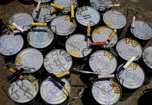
Did you know that there's a tradition of painting graphic murals onto farm buildings in North America? (barn quilts). For some reason this got me thinking about the tiffin tin labelling system which helps to ensure that 175,000 lunches a day are safely delivered in Mumbai. Oh and also the graphic language called X-code used by rescue working for marking details of casualties and hazards on the doors of buildings in post-hurricane New Orleans.
You won't find any of this stuff on Dribbble though. I hope.
2. Sketch on paper first.
I know it's tempting to dive straight into Photoshop (and I sometimes do myself) but try to resist the illusion of safety that it affords.
Draw small layout thumbnails so that you can't add too much detail initially. Or use a big fat marker pen to place a similar restriction on yourself if you want to sketch at a larger scale.

I try to draw at least 3 possible layouts for any given page. And then force myself to do another 3 if I can. You'll know when you've done enough drawing because your brain will start to hurt a wee bit.
3. Iterate, iterate, iterate.
In the past I've worked up over 20 variations on a single page before nailing the design. I don't know if that's a good or a bad thing, but I do know that my first few attempts at anything are usually bound straight for the scrap heat.
Thomas Edison had the right idea:
I have not failed. I've just found 10,000 ways that won't work.
4. Leave it overnight.
Most things in life make more sense the next day.
If you're lucky you might even have a flash of inspiration in the meantime, when you're on your evening run or in the shower or doing whatever else it is that you do when you're a not at your computer pushing pixels around.
When you come back to your design the next day, the best and/or the worst things about it will jump out at you.
You'll probably hear yourself thinking "oh man did I really make that?" or "Hot damn, that looks the shizzle".
Hopefully it's the latter but if you don't allow yourself some breathing space you won't know either way.
5. Squint
Seriously, screw up your eyes and peer through them at your design.
Or print it out and look at it from the far side of the room.
Either of these techniques will give you an overview of what's happening in your design. You should then find it much easier to notice any details which aren't consistent, or if your composition is lacking in contrasts of scale or tone.
6. Limit your options.
Limit yourself to using a maximum of 2 typefaces at a time. Maybe 3 if it's your birthday.
Limit the number of type sizes that you use. If you're using more than you can count on one hand then you probably have too many.
Limit your colour palette. Be respectful of the established conventions of web design: use colour (consistently) to indicate which elements on a page are clickable, think twice before using a lot of red (which usually indicates errors or danger).
By placing these restrictions on yourself, you'll actually make your job a little easier. The less options you have, the easier you will find it to be consistent.
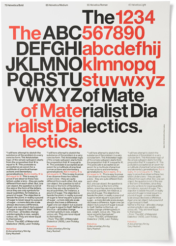
One of my favourite design studios — Experimental Jetset — use Helvetica for much (not all!) their work. But their thought process is so rigorously imaginative that it's impossible for the work to become boring. And as they rightly point out:
To try to see our work as nothing more than a manifestation of a certain typeface seems absurd to us.
Design is more than style. Work the idea first and then give it form.
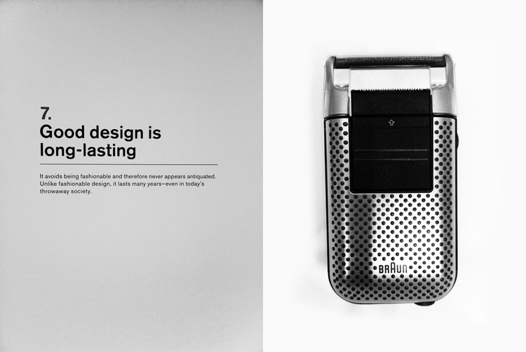
7. Be aware of, but not a slave to, current trends.
The more elements of whatever is currently in vogue that you use, the quicker your design will date.
This is fine of course if you are creating something very much of the moment, for a client in fashion perhaps or one of those stupid design conferences.
But generally speaking, you want your design to last as long as possible.
Dieter Rams put it much more succinctly than I can:
8. Teach yourself the basics of good copywriting
If 95% of web design is typography, then clearly yes, typography is important. Your job as a graphic designer is to create a visual language. But that shouldn't stop you from paying attention to the meaning of the words in your design as well as how they look.
Especially given that on many jobs, you are the copywriter as well as the designer.
Spend some quality time on copywriting sites like Copyhackers and you'll soon pick up some new and improved ways with words, that will make your designs more effective. (By more effective, I mean that they will be more persuasive... more likely to get your users to do the things that you want them to).
There's a nice side effect here: the clarity of your writing has a symbiotic relationship with the clarity of your thought. Being a better writer makes you a better communicator, and ultimately a better designer.
Whatever you do, don't be dismissive about your capability for improving your writing. A little extra work in this department is well worth it, even if it does feel like you are back at school.
</p>
9. Use a grid
Ooof —look at me — casually throwing in grids at the end of my list.
The thing is that using a grid doesn't automatically improve a design.
So I'm not going to attempt to summarise my approach to grids here... it's something which deserves a dedicated article of its own.
In the meantime you could check out Mark Boulton's "Five simple steps to designing grid systems" for a great primer on the topic.
10. Don't use a grid
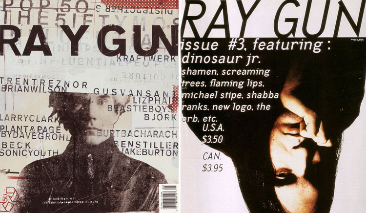
I guess what I'm saying is that you don't need necessarily need to get your knickers in a twist about grids just yet. Non-conforming designers like David Carson have built entire careers around not using them.
And like all rules, it is there to be broken.
So feel free to ignore any (or all) of the suggestions on this list.
Disclaimer: I work primarily in the digital realm so this list is tailored more at web designers rather than print designers. But I’d hope that it is general enough to be useful to both parties.
Posted to graphic-design in 2013.