I don’t know how long it’s been this way, but it seems to be standard practice in the graphic design industry these days to present three design routes to clients.
Usually there is a preferred route (the one you want the client to pick) alongside a not-so-preferred route, and one which was cobbled together at the last minute to make up the numbers.
Sometimes the client picks the route you want them to. Sometimes they don’t. And sometimes the client will pick elements from each route and ask you to combine them together.
“We like the buttons from that route, the colours from that route, oh and is there anything you can do to make it a bit more… creative?”
I didn’t know there was a word for this process (if you can call it that) until today.
Frankensteining.
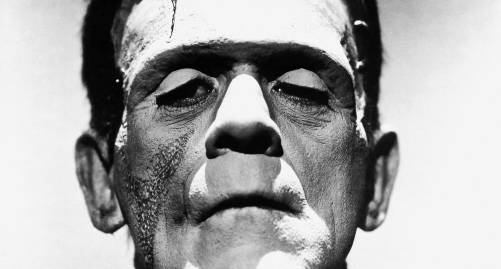
Published when its author Mary Shelley was just 21 years old and often considered the world’s first science fiction novel, Frankenstein was the story of a hideous creature fashioned from old body parts. As well as setting the blueprint for a new genre of writing it has also, unfortunately, become a term to describe how design concepts are presented to, and picked apart by, clients.
Apparently frankensteining is more commonly used in fashion to refer to a stylist who combines elements of different outfits together into “an outfit that sort of works, but is largely wrong.”
Before I return to the field of graphic design, I should point out that sometimes frankensteining can be a good thing. Like when you need to hack something together. Maybe a recipe instead of a monstrous creature though — often when I’m looking up a new recipe I will take elements from the 2 or 3 best looking versions I can find and combine them together. I find it easier to whittle down the ingredients this way.
For all his effectiveness as a rudimentary human, Frankenstein wasn’t the best looking of chaps.
And because it is the visual that we are concerned with here, I don’t think frankensteining is a good process to include in your graphic design workflow.
As one usability glossary I found whilst researching this article puts it:
"A typical situation is to present multiple design options to a client who asks for a piecemeal combination of features. While the original designs each conveyed a unified message, the combination is a monstrous hodge-podge. "
Ouch. That sounds like the opposite of good graphic design to me.
So why is presenting multiple routes standard practice?
Good question. I don’t have a definitive answer to this.
For starters though, I think it feels like a safer option. In a pitch scenario especially, where you’re not sure of the client’s preferences or requirements.
“If they don’t like this, they might like that… or that…”
On a sidenote, not knowing your client is another good reason not to do unpaid creative pitches. How can you design blind before you have come to a real understanding of your client and their company’s personality and requirements?
The alternative to frankensteining
Of course, you will probably still want to work up multiple options internally. That’s fine and dandy. But then you should do the whittling down yourself, instead of letting the client muddy the waters. (Sometimes a client will even provide simultaneous feedback on your 3 routes, expecting you to update all of them in the next round of visuals. Which compounds the problem yet further).
So. Make sure your client is clear on your intended course of action. Then take your single route. Spend some of the time you would have spent working up other routes on refining it. Iterate. Iterate. Iterate. Pour some love into it. Pour some more thinking in too.
And before you even show the client your work, talk to them about it. Restate the brief back to them. Outline the points you think are most important, and the angle of approach you intend to take. Only after this is done, when you have them prepped and on your side, should you open up your laptop or presentation to show them the visuals.
Sceptical? I know that it’s possible to present only a single route to clients and stay in business, because it happenedat the last studio I worked at. In fact it was standard practice. There were even times when we refused to present visuals at pitch stage at all — the directors would go in with a concept, explained using only words and possibly… possibly… with a wireframe. It made the studio massively more efficient — the rarity of overtime when I worked there was testament to this. I worked from 10am-6pm most days, and I came to consider 7pm a late finish, instead of 11pm as it had been at my first job.
Caveat: there are times when presenting multiple routes makes a lot of sense. During the early stages of an identity job where the spectrum of possible solutions is far wider, or if you are exploring photography styles for a shoot.
But when you are working on something more constrained (like a website) presenting multiple routes could be seen as an admission that you don’t know what’s been asked for.
You don't want your client to dine à la carte. You want to sell them the special.
I know that it’s much harder to change your working methods if you’re part of a large team of designers. But if you’re self-employed, there’s nothing stopping you from presenting a single route.
Here’s a recap of the reasons not to let your client frankenstein your designs by presenting multiple routes:
- You'll save time and energy.
- Your client will get the best design possible, not a diluted set of ideas and the opportunity to dilute them further. (In the long run, I think this makes your work more unique, because it forces you to distill your thinking).
- It makes the task in hand for the client (providing rational feedback: I don't like X because Y) much easier. Offering multiple choices (of anything) makes decision making harder.
PS. Just in case you don’t know, fugly = fucking ugly.
Posted to graphic-design in 2013.